What we need if we want AI to improve website accessibility

In accessibility circles, we’ve had a lot of fuss over the last few years to do with overlay products. These are scripts which fix accessibility problems with a web page after it has loaded, and they’ve been around since the commercial web became mature. The idea is that they “overlay” accessibility over the top of the existing site. Sometimes they do this by making adjustments to the site’s code, sometimes by providing basic assistive tech like contrast themes or text-to-speech tools.

I’ve contributed content to the Overlay Fact Sheet website as well as signing the statement. My main problem with overlay products is deceptive marketing – often the people selling these products exaggerate what they’re capable of and how helpful they are. They can be useful for people with both developer and accessibility experience, who know what to expect and what the limitations are. So I’d never give a blanket recommendation of “no overlays ever”.

But the Overlay Fact Sheet was really prompted by one particular overlay product which crossed the line from exaggeration to outright bullshit in their aggressive promotion. They didn’t just say “we can help with accessibility”, they said accessibility professionals are awful so everyone should use our product instead. So I was happy to try to push back against that argument.

The truth is, I’d be thrilled if overlays actually did everything their marketing teams claim they do. I’ve been an accessibility specialist for about 10 years now, and it’s exhausting having to constantly tell people “you need to provide alternative text for meaningful images, and hide the decorative ones from the accessibility API”. If there was a tool which could take that problem away, that’d give me more time to work on more complex problems like focus management in web apps or how to build accessibility into the procurement process.

(Side note: I work on education with developers, and I believe there is still lots of room for improvement there. Accessibility is not built in to any sort of dev training in a way that works at scale, yet.)

In the last few months there’s been an explosion of AI tools, with all the media coverage you’d expect of something that seems like science-fiction come to life. Sci-fi fans are already familiar with all of the debates but now those are reaching mainstream audiences. And as always with social media, people get pushed into binary thinking and opposing camps: either AI is going to be amazing and we should welcome our new overlords, or AI is going to turn the internet into piles of kipple and grey goo where no human will want to be.

My own feeling is that machine learning technology is good enough now that we will not be able to avoid it. If I’m right, then we have to start training it better. Any AI tool is a probability machine, picking the most statistically plausible option from a range of choices it’s learned from it’s training body of work. So you could train a joke app on videos of stand-up comedians and comedy movies and joke books for kids. And it would learn the structure of a joke based on the common features, and possibly generate some new ones by remixing old material.

I looked up how the AI-powered overlay tools claim to work, and found this statement on the website of a well-known product:

It visually matches elements and behaviors to millions of past encounters to learn from context what elements actually do and their purpose on the page. Then all the necessary code adjustments are implemented to reflect blind people using screen readers precisely what’s on the screen and the purpose of every element, exactly as it was intended originally.

My problem with this process is in the first sentence, not the second. Most websites I’ve used (both professionally and personally) have some very confusing visual styles. My favourite example is the concept of a “dropdown”, which covers a dozen different types of UI and is easily abused (swearing warning on that link!). The visible UI of most websites is confusing and was built with no UX guidance. If the machines are learning from the existing web, then their training body is low-grade crap. I’m actually ok with the overall visual dodginess of the web, because I think the trade-offs (reduced gatekeeping of communications tech, a portable and flexible medium) are worth it. I just wouldn’t want to train my new AI overlords on the websites I use and enjoy every day.

If I want AI to take over my accessibility job, either as an overlay or a really good code linter or a no-code website builder, then I have to work harder to make sure that AI has a better body of work to learn from. That means I want everyone to start making more accessible sites now, with accessible UX and visual design and code. Then we can let the machine-learning tools loose on those, they can be uplifted into a genuinely competent AI which will make all of our new websites accessible.

This is a bit disappointing – for AI to put me out of a job, I have to do my job for longer first. I’ll hold off on booking that beach vacation for a while, I suppose.

Please Hold

Most of the time, I work on accessibility projects – either as part of my job or volunteering for non-profits. It’s usually auditing or sometimes a bit of front-end web development. But a while back I had an opportunity to do something different: I made a small web site which was featured in a short film. Not a website for the film, but a website in the film.

The film is called Please Hold, written by KD Davila and Levin Meneske, and directed by KD. So far it has screened at a bunch of film festivals around the USA and the world. Along with winning a bunch of prizes, it took the honours for Best Short at the Florida Film Festival, which qualifies it to be submitted for Oscar contention. We just found out last week that it made the shortlist for the Oscar’s live action short film category, along with 14 other short films! We’ll find out in a month or so if it gets nominated.

My husband Dave is a VFX guy and was helping out KD and Levin with this project. One of the things they needed was an interface for a prison system. It was going to be put on a big screen inside a prison cell, and the lead character would interact with it to make phone calls, order meals, and so on. In the past, Dave has found that doing this sort of stuff as a visual effect makes things difficult for the actors. They have to imagine what might be there and how they’ll interact with it, and that’s on top of doing their main job of acting the lines and directions that are needed for the story. Since there was going to be a screen there anyway, why not put an actual interface on it? Then the actors could just treat it like a prop instead. He suggested that I build it, based on the designs they’d already had drawn up by Youthana Yous.

I was pretty excited to make a site that wasn’t for work purposes. Then I read the script and I was super-excited – the story is very zeitgeisty, about automated systems and civil rights. It’s also darkly funny, in a low-key ironic way. Pure Julie bait!

A police drone hovers in front of the face of a young man.
One of Dave’s VFX shots

Dave was my art director and gave me heaps of good advice on usability aspects that would only come up on a film set. It’s a very different use case than I’m familiar with! And my friend Amy Kapernick was tech support for the film crew during the actual filming. Dave and I had scheduled a wildflower trip that just happened to overlap with the time that KD and Levin had to film in LA. We were in and out of mobile phone range with barely any internet, so Amy was on call to make any last minute adjustments they needed.

We got to see the short on the big screen during Perth’s 2021 Revelation Film Festival, as part of the Slipstream and Sci-fi Shorts session. (I also really liked the short “Dry Fire” which is an Aussie post-apocalyptic story with a deaf protagonist.)

Unlabelled icons of a phone, person, shopping bag, etc over a gentle cloud background.
Correcticorp home page

The site itself was easy and fun to make. It was designed to look like a voice-controlled interface built cheaply by a giant corporation. I got to use a lot of vw and vh units and fake a bunch of page transitions.

I also got to animate the background and buttons in a fun and over-blown way. Normally I’m all about subtle animations, with the idea that if you do them right no-one will consciously notice them. But these needed to look animated from a standing distance, rather than if you were seated at a desktop or holding a tablet. So I took a bunch of animations from Animista.net and dialed the effects up to 11. On my computer they look like way too much, but in the film you can barely notice them, which is perfect. The site is just set dressing or a plot device, it shouldn’t distract you from the people.

5 options for meals, with an image, price and short description. Cheapest is a single carrot, most expensive is a lobster dinner.
Correcticorp dining menu

The site doesn’t have a proper navigation menu, since it was designed to look like a voice interface. But it had to be controlled remotely by a crew member to make sure all the actions relevant to the plot happened at exactly the right time. So I made a kind of site map page, with instructions for how they could hide cursors and use F11 to make it full screen.

Another feature was to use editable areas in some places, so the crew could adjust the amount of money in the lead character’s bank account. I also made a few extra variations of pages, just in case, and some blank pages so they could use visual effects to put whatever they needed on top. These were used to show Scaley, the automated legal advice service – like Clippy or a chatbot, but more annoying because your freedom is at stake.

There were also hidden controls to start and stop animations that have to run while the lead actor is playing his role. I’ve always wanted to make secret controls on a site so this was more fun for me than you might expect.

A bank balance and transactions list, with an extra popup menu for buttons that start and stop animation of the bank balance.
Correcticorp banking with my ‘secret’ controls

If we’d had more time, I’d have learned just enough React or Vue to make the page transitions easier. A bit more time for re-factoring would have been handy, but that’s the same for any project.

If I were to do it again, I’d make more editable text areas. Those take 30 seconds for me, but might have been very useful to let the director and crew adjust things on the spot. And I’d add a settings menu to make changing the appearances of things easier for the crew.

And before you ask: no, the site is not fully accessible. It works with a keyboard because that’s just how I build things, but the contrast is low, nothing has a visible text label and the animations would definitely fail WCAG. I reckon this makes it more authentic – a money-grubbing corporation profiting off human misery wouldn’t bother to have an accessible digital product!

After awards season is over, Please Hold will be available… somewhere! Online, probably. I’ll post a link when that happens, because apart from being proud of my tiny contribution I really enjoyed the film. So I reckon everyone should give it a watch when they can.


Canvas, HTML and the future of the web

A few months ago Google said they were going to start using the canvas element to render the content in Google Docs, instead of the full set of HTML elements. They’re already testing it, and are finding that it gives them performance improvements.

A chess board with a hand using a white king to knock over a black king.

Accessibility

Of course, the accessibility community is worried about this. The <canvas> element is a black hole for the accessibility APIs – information goes in but doesn’t come out. So assistive software like screen readers or switch controls or speech recognition can’t tell what’s going on in there, and therefore they can’t provide support to the people who need it.

I’m sure Google can make Google Docs accessible though. They’re already looking at something similar to the shadow DOM, I believe. And they’re working on an Accessibility Object Model (AOM, link goes to the draft specification), a kind of partner to the DOM. I’m not so keen on the side DOM based on my experience of the shadow DOM so far. But I’m interested in the AOM as I think it has a lot of potential. And honestly: you can make anything accessible if you’re willing to put enough time and energy into it. Google certainly has the resources to do this.

My fear is that just like a bunch of other tech “innovations”, accessibility will be treated as an edge-case which can be fixed with a plugin or by turning on a setting. Google really should take a note from WordPress and Gutenberg – they assumed that accessibility could be added later, like a nice-to-have feature. But bolt-on accessibility is never as good as when it’s considered from the very beginning. It’s always patchy and poor quality and needs workarounds to get basic functionality happening. And people with disabilities shouldn’t need to run campaigns to remind developers that they exist and have the right to access digital information.

I don’t think this will matter too much in the end. Google will bolt on some access, and the performance improvements of a fraction of a second per document will be worth it because of the sheer size of the thing. They had a billion users several years ago, I can only assume there are billions of documents too, so it all adds up for them. Google Docs isn’t great for accessibility as it currently is anyway, so most likely it will just change to a different flavour of awkwardness.

But then you’ve got the question of power. As Matthew McDonald says in Can Canvas Rendering Replace The DOM?:

…it centralizes the power in the hands of the app. If you control the pixels you can do anything — bypass automated tools, defeat adblockers, restrict browser features like search and text copying. It’s a JavaScript-flavored reincarnation of Flash or Silverlight, without the installation requirement or compatibility questions.

He’s a lot more cheerful about this than I am, and predicts that this move will lead to huge changes to make writing web apps more like writing native software.

My underlying concern is how many other web developers will move to rendering whole sites in <canvas> just because Google Does It, so it must be the best thing. We’ve already seen the shift from static and database-driven sites changing to full reactive state frameworks because Facebook Does It, even though hardly any of those sites benefit from it. But the chances of all those devs doing the same amount of work on accessibility as Google is pretty slim. They won’t have the staff, time or skills, they’ll just plonk down a drawing of some text, add the latest in advertising tech, and call it a day. Then it will be the new standard just because it’s the most common way to do things.

Gatekeeping

Part of why I’m assuming the tech bros will try to leap to <canvas> is because I feel like all the big corporate Computer Science folks are super excited to ditch HTML and do “real” programming instead. Any day of the week you can find people complaining about how terrible HTML and CSS are because they were only invented to present documents, but real applications have much more complex needs. You can do all sorts of fancy programming and treat the <canvas> element as a compile target, with the bare minimum amount of time spent writing HTML.

It smells a lot like gatekeeping to me – people who have invested a lot of time, money and effort into something don’t want other people to be able to just show up and do it for free. So they pretend the tools that are easy to use are inferior, and so are the people who use them.

That kind of attitude can be easily taken advantage of by corporations who want the word “internet” to be replaced by “Google” or “Facebook”. They promise developers the power to change the world, while they try to control as much of it as they can. Walled gardens are back and although they’re more sophisticated than AOL, they’re still a poor imitation of what the internet could be.

Because the beauty and promise of the web is that you don’t need a Computer Science degree to make a site. HTML and CSS are easy to learn even though (like chess) they can take years to master. If your HTML has mistakes, the browsers will make a guess at what you mean instead of throwing errors. CSS will just ignore anything it doesn’t understand and move on to the next line. Anyone can have a go.

You don’t need to wait for some corporation or Rupert Murdoch to give you a platform – a cheap hosting plan and a free text editor and you can DIY your own crappy site where you can say what you want. Yeah, it’s mayhem out there. But it’s also given billions of people a path to international communication.

It’s a bit like when digital cameras came out – a lot of professional photographers complained about the devices, complained about the quality of the photos and laughed at the terrible mistakes made by all these new photographers. Meanwhile, millions of people had a new way to express themselves and communicate. Flickr didn’t really survive the transition to responsive design but for a few years at the beginning of the digital photography era, it was amazing. You could see the whole world in your browser, when before it was just a whole lotta text.

Putting the means of communication and art into the reach of more people doesn’t mean we don’t need professionals or native software. If you want to make software and complex applications, that’s very cool and I’m very grateful. Some of my favourite web sites are web apps! But just because software engineers have particular requirements, doesn’t mean that other tools are worthless or outdated. The web should be flexible, accessible, ubiquitous and open. That might mean a trade-off of performance, or style. But simple, robust tools which can be used by anyone are still powerful and disruptive. Even when, or maybe especially when, they’re not “elegant”.

Credits: Photo by GR Stocks on Unsplash

Conference captions

Unn points to one of the screens used to display the captions
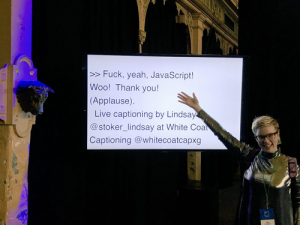
One of the most considerate features of CSS Conf AU and JS Conf AU was the live captioning. There were three large TV screens in the main theatre, displaying live captions of what the speakers and MCs were saying. The captions were provided by Lindsay Stoker of White Coat Captioning. I stole the picture of Unn with the captions from Jonny!

I wish live captioning was more common at large events. Apart from enabling Deaf and hard-of-hearing developers to get the most from the talks, I noticed heaps of other people who were grateful for them too. Some of the reasons I heard or saw in the event hashtags were:

  • People with English as a second language were able to understand all the speakers more easily
  • Audience members more easily understood the accents of speakers with English as a second (or third!) language
  • People with attention issues (and those who got distracted by their phones!) could keep up with what was being said

I’m also guessing it was easier for the organisers to provide captions for the videos of the talks too.

So if you’re undecided about paying for live captioning at an event, I hope you’ll decide to go for it. It really does help so many people get maximum value from the speakers you’ve worked so hard to present.

CSS Conf and JS Conf 2018

Last December I found out that my proposal for a talk at CSSConfAU had been accepted. I was so freakin’ excited, you wouldn’t believe. CSSConfAU has a deservedly great reputation as being an excellent conference, and I’d be able to stay for JS Conf AU as well.

Lincoln the echidna tries to get into the food bucketSo on the 17th March I packed my bags and jumped on a plane to Melbourne. I had time to see my sister and her family before the conference events started. On the Sunday there was a speaker activity day – we started with breakfast, then went to Healesville Sanctuary (highly recommended, I got to pat an echnidna!), then on to a winery. I got to know a bunch of the other speakers and get excited to see their talks. On Monday I met up with friends and rehearsed one more time before getting an early night.

CSS Conf AU

Tuesday was CSS Conf AU. One of our speakers wasn’t able to enter the country (thanks to our racist Immigration Department, I’m guessing, although I don’t know exactly what happened) so I was speaking a bit earlier than I’d planned. I got to the venue in time to grab a coffee and say hi to people before the other talks started).

I enjoyed all the talks but the ones that were particularly useful to me were Jeremy Wagner’s on responsible web fonts, and the one-two punch of cultural talks from Teresa Ma on communication between designers and devs, and Ivana McConnell’s on respecting the expertise and passion of developers who took a different path to the stereotypical computer science degree.

Me on stage, wearing a headset mic and looking all professional
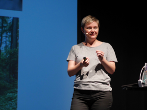
I think my own talk (on using CSS to support users with low vision) went well. I didn’t fall off the stage or forget any major points, so I’m going to claim it as a huge success! But people said I gave them practical, easy-to-apply advice which is always my main goal so jokes aside, I’m glad people found it useful. Also Kevin Yank took a nice photo of me so I’m stealing it and putting it here!

There was a fun, relaxed after-party at the venue with board games and video games as well as drinks and dinner. Amy and Patrik managed to tie in a game of Ticket To Ride, and the Perth gang crammed ourselves into a photo booth which was hilarious to us and probably worrying to the photo booth staff.

JS Conf AU

The next day was the first of JS Conf AU, but I missed the morning sessions because I had to finish preparing for another talk at a meetup that night. I did get there in time to see Suz’s talk about the new and still evolving WebUSB API. I love poking at hardware as long as I don’t have to acheive anything practical so it was super interesting to me. (Note to self: finish blogging about Stranger Strings!).

There was a party that night as well but I headed out to the Melbourne Junior Dev meetup with Mandy, Jess and Amy. LJ had claimed us to give talks at her group once she realised there was a gaggle of Perth devs visiting the same week as her meetup was on.

Junior Dev meetup

Me, Mandy, Ash, Amy and Jess all squished in for a picture together Junior Dev in Melbourne is a great group and I really enjoyed myself. I gave a talk about Accessibility Basics that went way too long, and no-one threw eggs at me for that, so they’re clearly a wonderful group of people. The juniors asked me a bunch of great questions during our hang-out time afterwards, which always makes me feel like I’ve done a good job. Amy talked about how she was using CSS Grid in production, and Mandy showed her amazing text effects. I hope everyone had a good time!

Back to JS Conf

I was able to make it to all of the second day of JS Conf AU. I particularly loved Madleina’s talk on raytracing in Javascript (difficult stuff!), Tim’s speedrun through the concept of generated art, and Brittany’s talk on helping juniors (and ourselves) by writing better error messages for our tools, and raising bugs/issues when we come across any which could be improved. I think following her advice will help my own written recommendations in my work too.

The after-party that night was fantastic. I got to chat with friends old and new, and join in with a bit of a dance and a sing with karaoke. I was tempted to join the Mario Kart tournament, but I knew that Madleina and Pilar would kick my butt easily so I stuck to dinner instead.

Decompress

Mandy giving a presentation to a small group
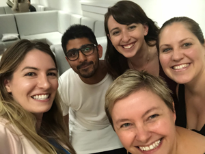
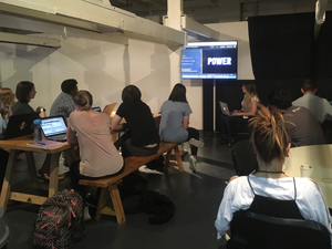
The final day was Decompress. I love this idea so much – some casual talks, some easy-going workshops, some chilling out on couches and noodling around on laptops. After an epic week of learning and presenting I didn’t have room in my brain for any more learning, but it was a pleasure to hang out at the venue and chat with folks while poking at my email and written projects.

Once more, with feeling

The venue and the food and drink were amazing. The swag was perfect for me – tshirts with CSS and JS slogans on them. I’m sure others will write more about those. The effort the organisers went to to make the speakers and the attendees comfortable was impressive. I’ll have to write a separate post about the live captioning, just because that’s my professional interest, but I really feel like they thought of everything.

The sad part is that this is the last CSS Conf and JS Conf in Australia for now. The current organising team have been doing it for several years, which shows in the quality of the event but also leaves them pretty dang tired. I’m convinced they’ll all be moving on to other wonderful things in the industry and commmunity after they’ve had some time off. Best of luck, gang, you are all champions.

I’m glad I got to be a part of such a thoughtful and inspiring event. I’ve been joking/not-joking that since I don’t have time for a heap of side projects, I’ll have to roll all my inspiration from last week into one project: an accessible 3D typography-based art project generated from people interacting with hardware, which is written in Elm and has really good error messages. I’ll let you all know when it’s ready 🙂